
Monday 7th November 2011
Negative Space
Today's lesson was about negative space. Negative space is almost a method used in graphic design, its almost like subliminal messages where in some cases there is more than one message.

An example that was shown in class of one of the greatest logo designs. The federal express has a played a very big part in relation to the graphics history. The logo was created by Richard Runyon, his intentions of the logo was to make it as simple as possible, so that other people could instantly know what it was about. He has definitely succeeded in this design as it will forever be the same because the design is solid. It stands strong against other companies as it is successfully iconic to everyone.


The adidas logo, great use of negative space to indicate a trainer and definitely iconic. The first designer was Adi Dassler in 1967 of the simple 3 striped logo. with good use of his name he basically put himself completely on this franchise which is associated with lots of games, sports, clothes and even deodorants; so a lot to give into the wide market. The lastest update towards the logo (from the left) shows now a clear indication towards the brand that they are marketing, which is just a more stable outcome. I really like the design its clean and its so simple. Making something with your name must be the greatest achievement and feeling; as a layout method I could have my layouts with my name laided out.

Created in 1972 Paul Rand which is almost like how it may have came out on the page once it was printed back in those days. It could also be how the screens displayed text in a horizontal line effect. This is a very popular design as your mind tells u that its a computer brand. It will look good in a layout as I could create so many different mock ups like changing the colour and the text. It really strikes you when you see the lines as your mind creates the image.
The Worldwide Federal Foundation Logo shows a Flawless final outcome of great sense of negative space. Using the image of a panda is reference to the most endangered animal of the planet and in the risk of being extinct. To just think how Sir Peter Scott designed this master piece, this shows just raw talent and a timeless logo that will be in the history book throughout the future.

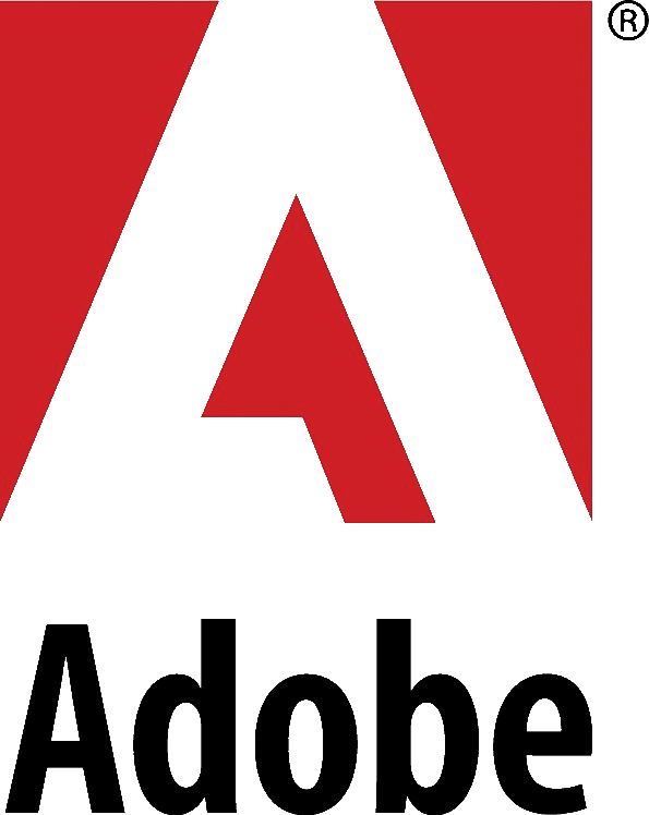
The adobe logo is another great example of negative space, this is widely know in the computer industry as being the most successful department in editing using different type of programmes such as illustrator, photoshop etc. Using the bold red colour this give the viewer a chance to stop and look at this piece and also admire how there programmes have maybe effected there lives day to day. The design was created by Marva Warnock.
 Being a car fan the F1 logo is one of the greatest. I started to notice how the F was a little rounded at the top and that is was on a type of diagonal slant; it was then to my knowledge that the 1 was on the space between. From that day I always will admire this logo as it shows pure strength into the design as well as the red streak marks showing its moving at a fast pace.
 As I'm a influenced by alot of music, I reguarly listen to the 1xtra music station. I have also found out on there logo that it has some use of negative space with just the one character "X". I believe this works really well in terms with there audience of black or white and combines there USP. A very unique and simple design of logo.
The adobe logo is another great example of negative space, this is widely know in the computer industry as being the most successful department in editing using different type of programmes such as illustrator, photoshop etc. Using the bold red colour this give the viewer a chance to stop and look at this piece and also admire how there programmes have maybe effected there lives day to day. The design was created by Marva Warnock.


